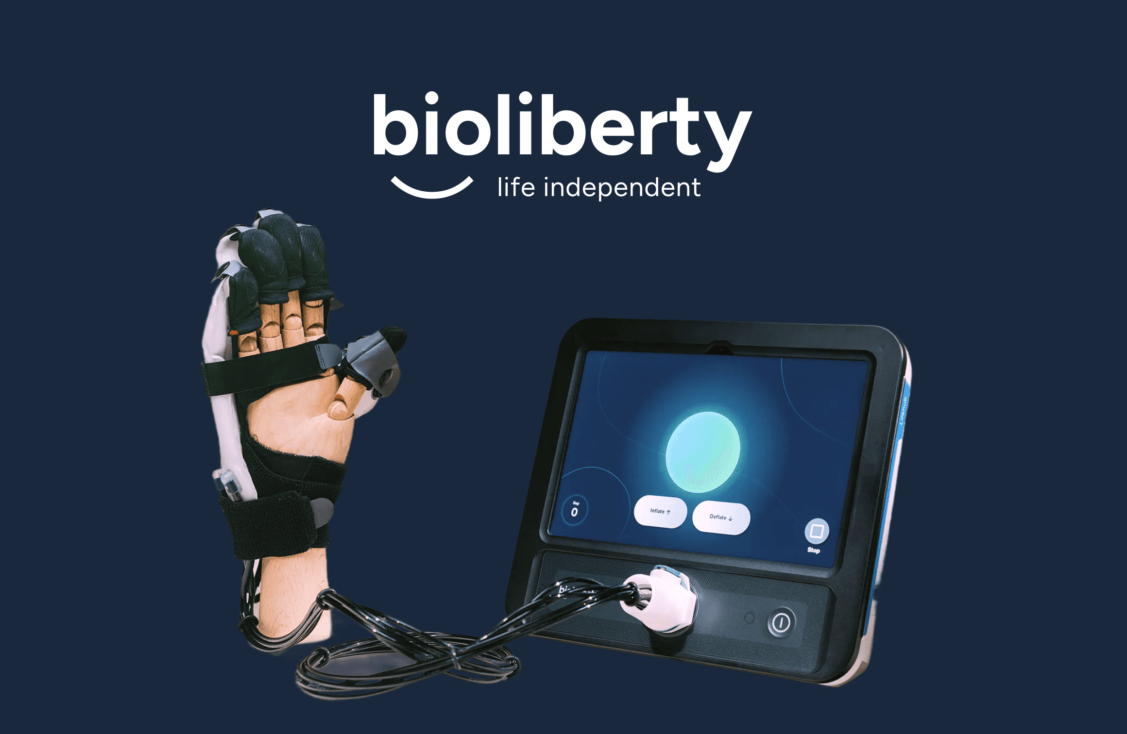
Bioliberty
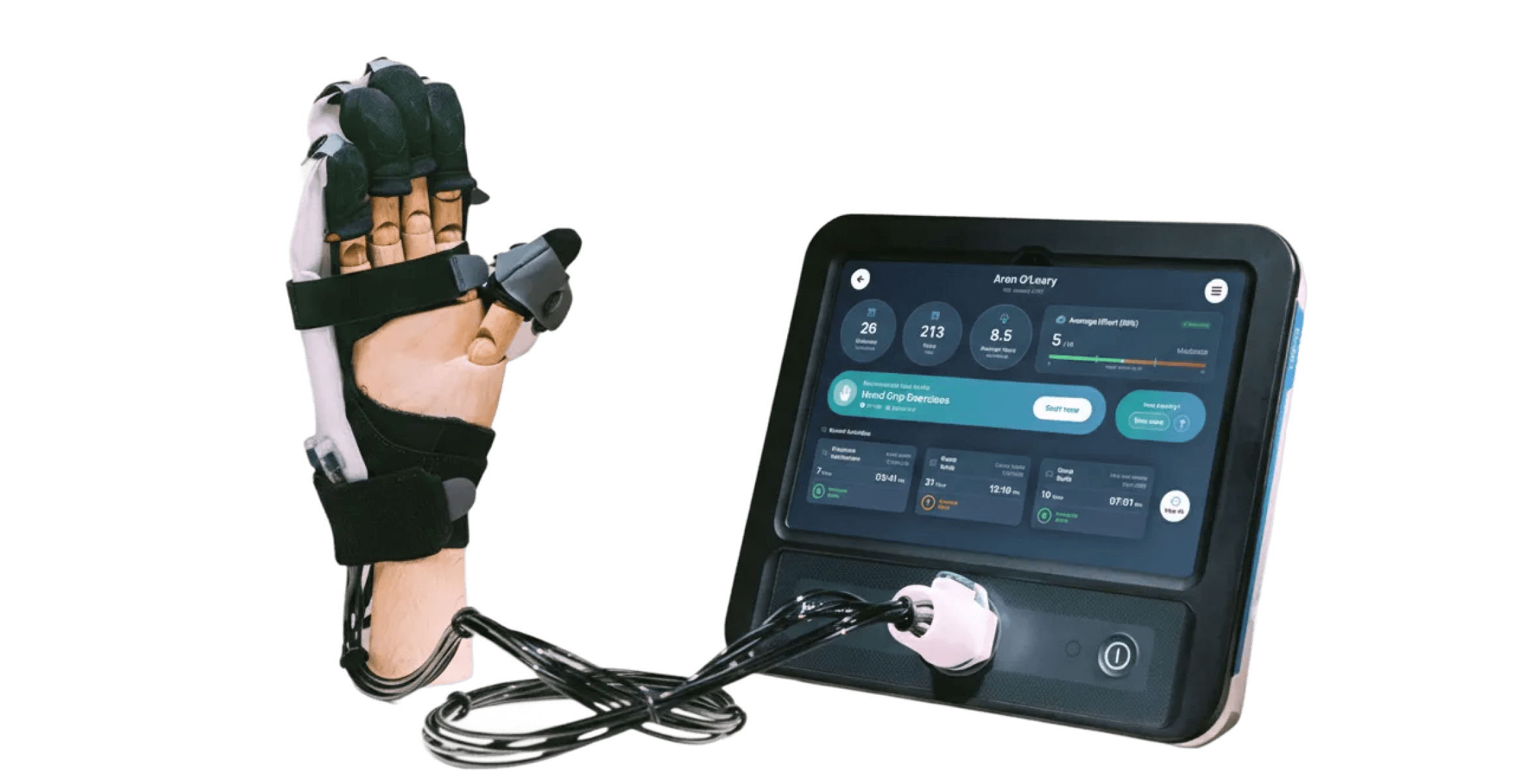
Bioliberty builds assistive robotic technology to support stroke rehabilitation. Their device combines a soft robotic glove with a tablet-based control system used by both patients and clinicians.
UX/UI Designer
Figma
Patient device app
Accessibility, clinical clarity, information hierarchy
The Challenge
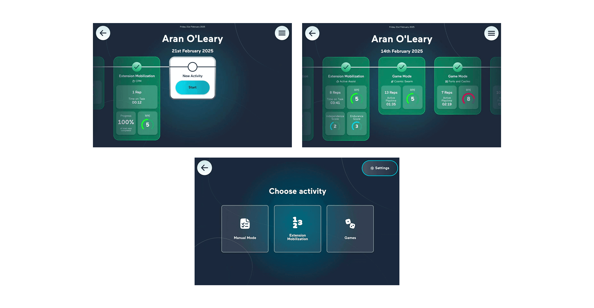
The existing home screen functioned primarily as a historical activity log. Currently it:
Was scroll-heavy and card-based
Displayed data without clear interpretation
Did not clearly answer three critical questions:
How is the patient doing?
What therapy should happen next?
How hard is the patient working?
In a rehabilitation setting, users often have limited time and cognitive capacity to interpret raw information.
Reframe
This screen should not be a feed of past activity.
It should be a clear, at-a-glance overview that supports patient confidence and clinician decision-making.
Design Strategy & Process
I anchored the redesign around three questions:
How is the patient doing overall?
What therapy should they do next?
Are they working at the right level of effort?
The problem wasn’t missing data.
It was missing clarity.
The original screen showed activity, but not meaning. Users had to scroll and interpret before understanding how they were doing.
So I flipped the hierarchy.
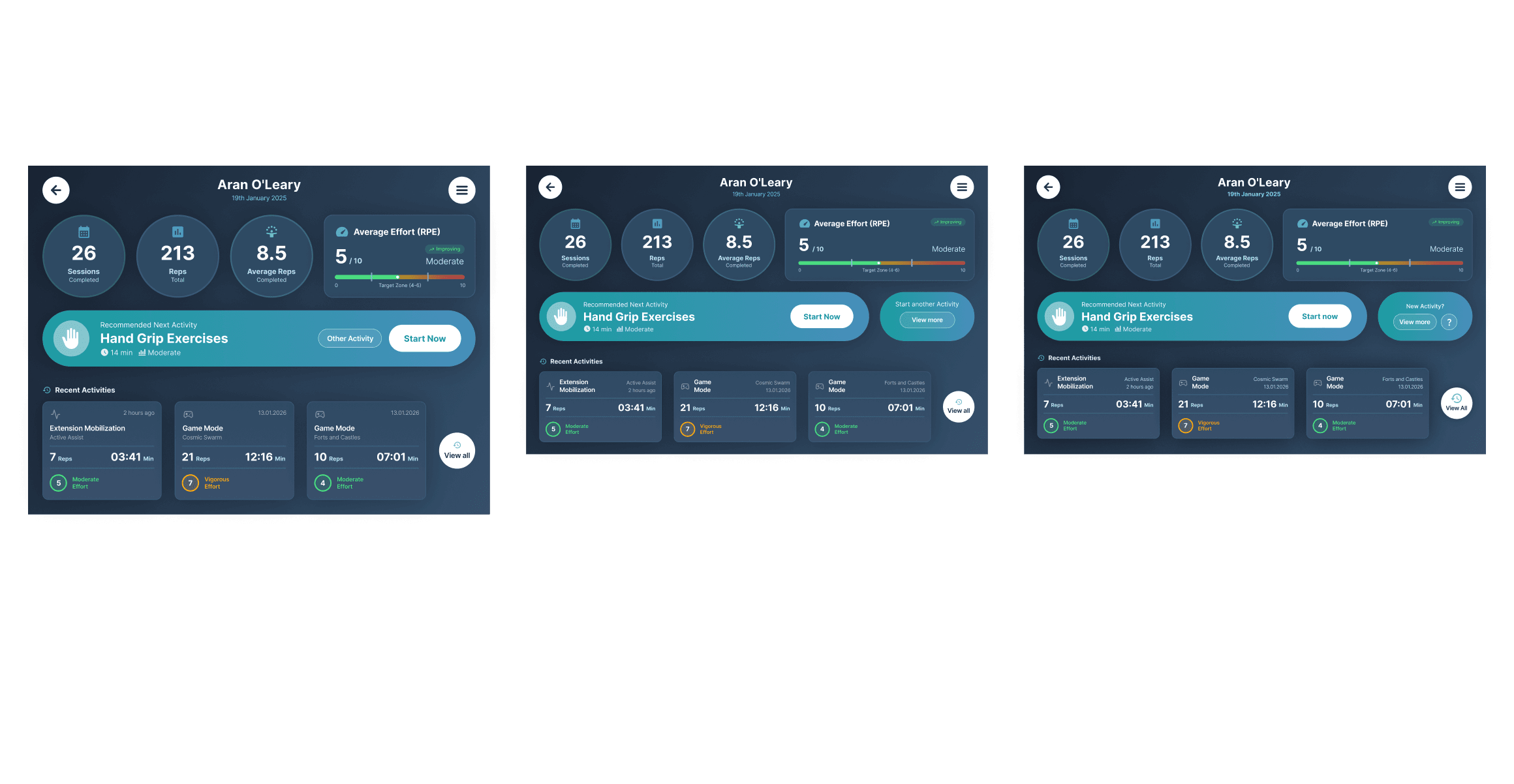
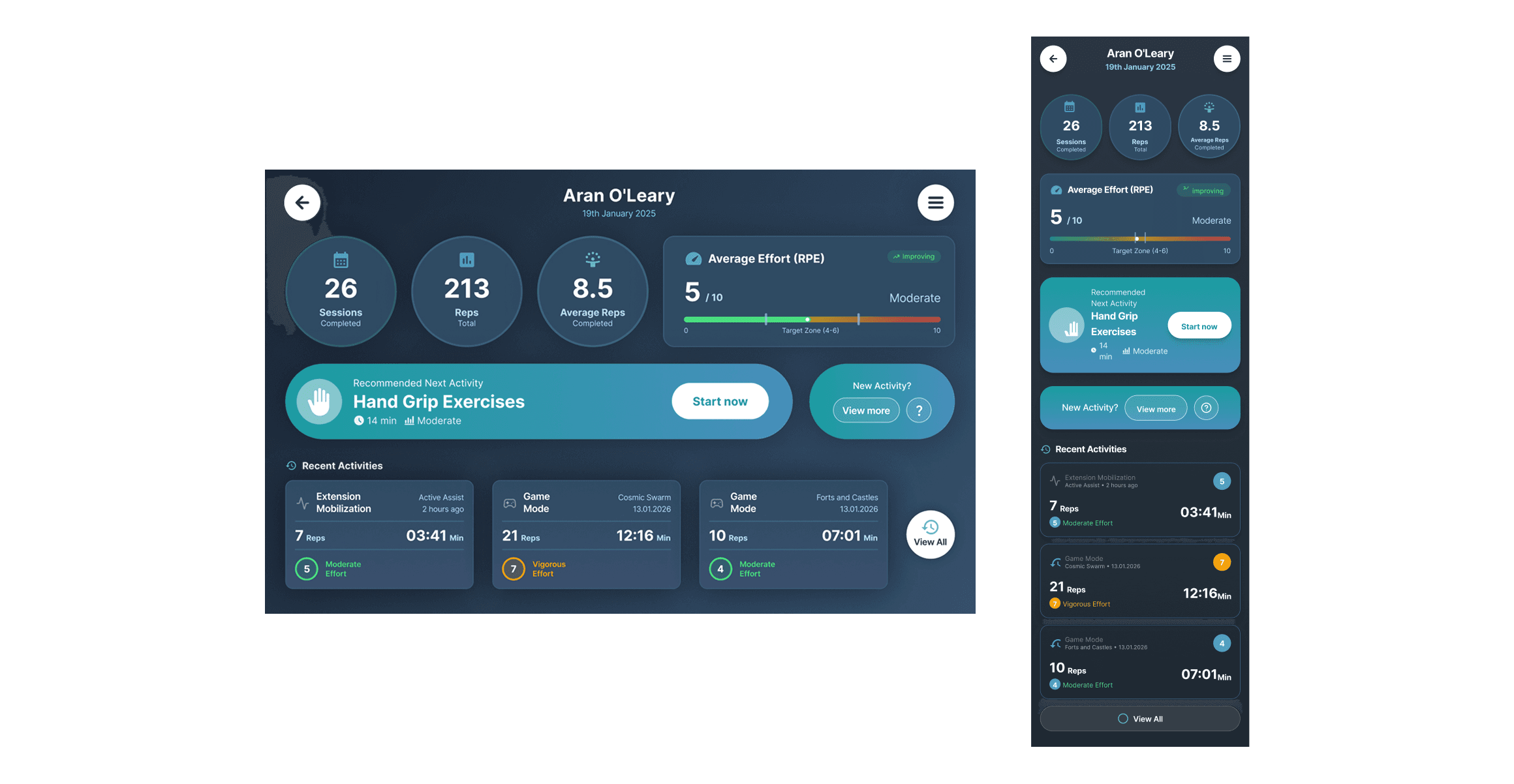
Insight comes first.
Progress is surfaced at the top — sessions, repetitions, and effort — visible immediately, without scrolling.
Action comes next.
A single recommended therapy removes uncertainty and guides the user forward.
History comes last.
Recent activity remains available, but condensed and secondary.
By restructuring the screen around progress, effort, and next steps, the interface becomes calmer, faster to understand, and better aligned with the realities of rehabilitation.

Accessibility & Risk Awareness
Accessibility was central to every decision.
Improvements included:
Larger touch targets
Increased spacing between interactive elements
Reduced reliance on scrolling
No precision gestures
Clear visual hierarchy
Meaningful colour usage (Green = within target, Amber = caution)
High-contrast combinations aligned with WCAG principles
In a medical context, reducing ambiguity reduces risk.
Outcome
By reframing the screen as a decision-support tool rather than an activity log, the redesign improves clarity, reduces cognitive strain, and prioritises clinically relevant insight. The interface now supports faster comprehension, safer effort monitoring, and clearer next-step guidance.
Future Work & Reflection
With more time, I would:
Conduct clinician walkthrough sessions
Run patient comprehension testing
Validate one-handed usability through observation
Test RPE interpretation accuracy
Begin formalising a cross-platform design system
The next phase would focus heavily on validation and iteration.
This challenge reinforced how powerful reframing can be.
By shifting the question from “how do we display activity?” to “what decisions does this screen support?”, the entire structure changed.
Healthcare design requires restraint. Clarity and reassurance matter more than visual complexity.
This project demonstrates my ability to:
Reframe problems strategically
Design for accessibility and motor constraints
Balance clinical context with usability
Think beyond screens to systems and decision-making