UX/UI Design
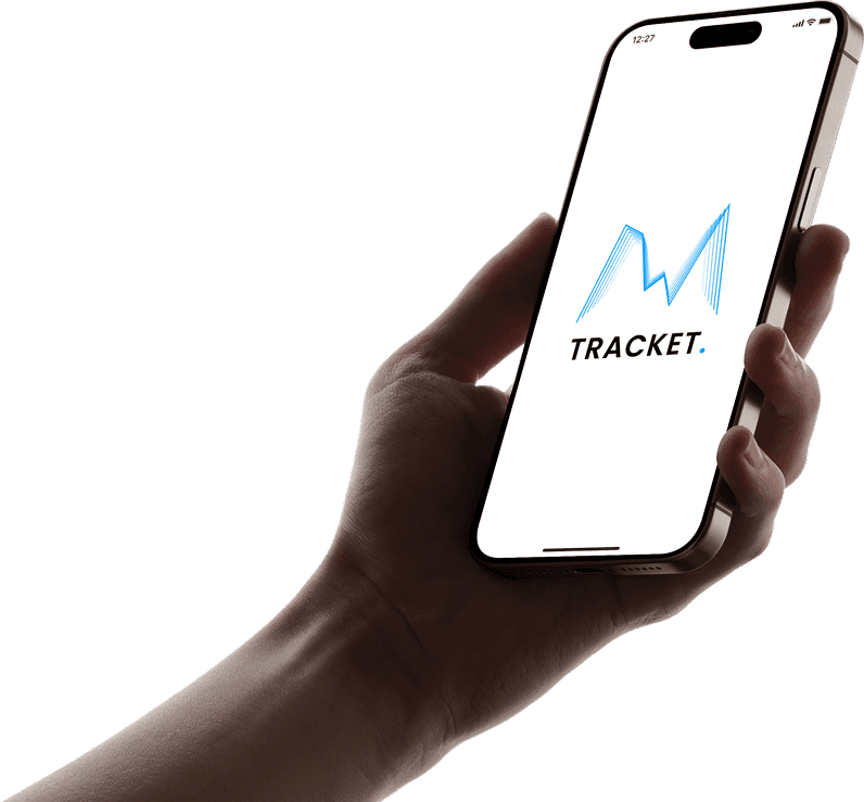
Tracket
Helping users stay on top of their spending with less stress and more style.
Tracket is a privacy-focused budgeting and expense tracking app that simplifies your financial life with customizable categories, clean visuals, and a lightweight experience that doesn’t overwhelm. Designed with diverse users in mind—from students to retirees—it empowers people to monitor spending, set goals, and build healthier money habits on their terms.
UX/UI Designer
Figma, FigJam, Google Forms, Miro, Illustrator
Academic Project (University of Edinburgh, MSc Design & Digital Media)
Designed It, Loved It, Built It
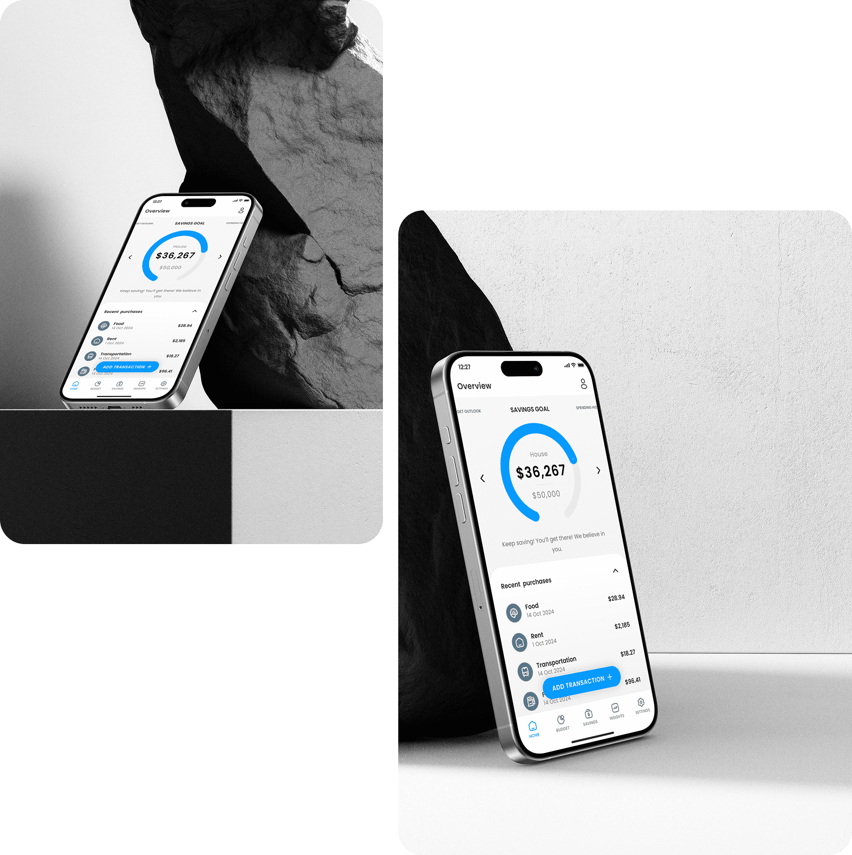
I enjoyed working on Tracket so much during the design phase that I decided to go one step further—I built the app in SwiftUI and uploaded it to the App Store. The development phase gave me a chance to bring the visuals and functionality to life, staying true to my original UI while adapting elements for real-world interaction and performance.
See how I built Tracket in XCode:
The Challenge
Let’s be honest—most financial apps feel like spreadsheets in disguise. They’re cluttered, invasive, and rarely designed for real people with real lives.
Many users want to manage their money but are turned off by:
Overcomplicated interfaces
Mandatory bank syncs (privacy, hello?)
Lack of flexibility or visual clarity
How might we design a budgeting app that’s intuitive, visually clear, and empowering—without requiring users to give up control of their data?
The Goal
Create a clean, accessible, mobile-first app
Prioritize manual input to support privacy-conscious users
Use visual insights (charts, progress bars, summaries) to make spending more understandable
Support custom categories, savings goals, and notifications
Design for a wide demographic—including older, tech-cautious users

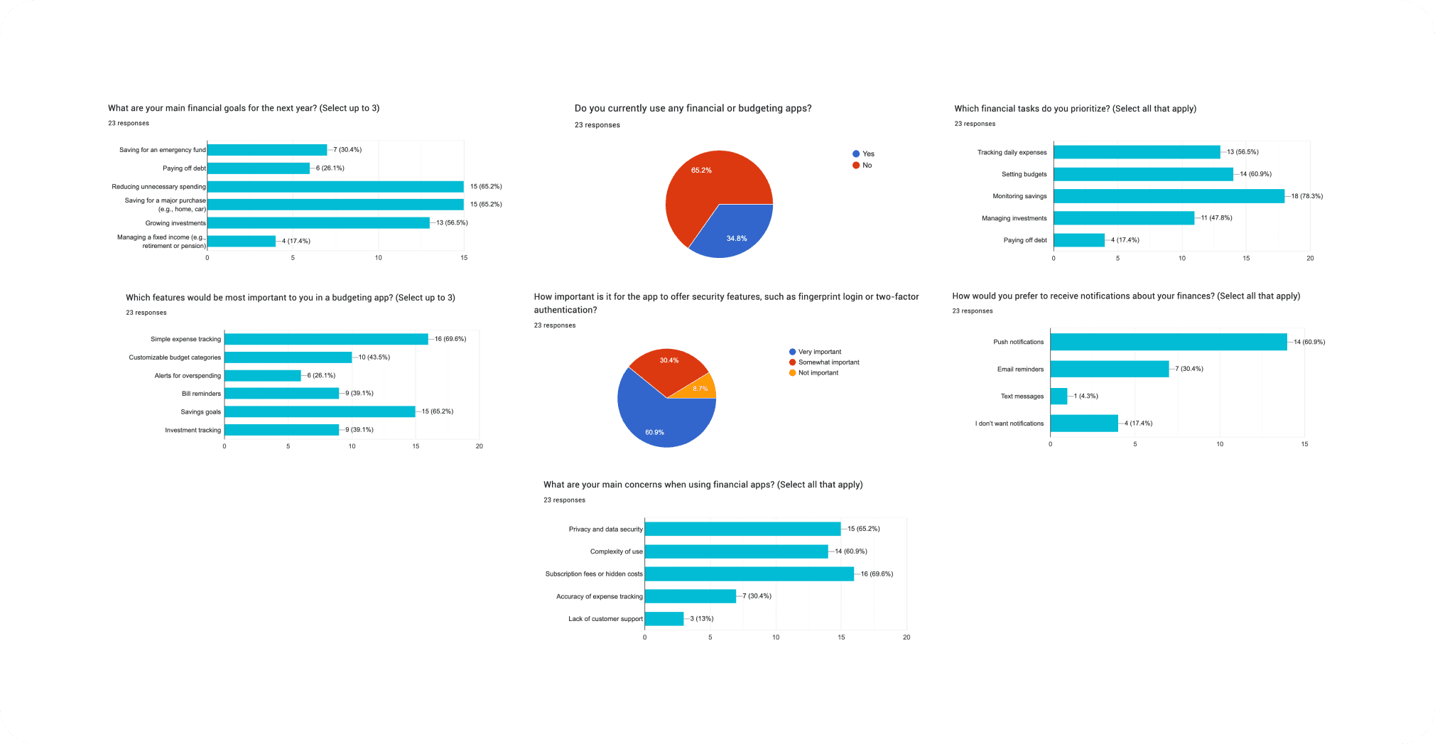
User Research
I surveyed 23 users (ages 20–65+) and conducted interviews with 3 personas—Kevin, Jane, and Doug.
My aim? Understand how people actually budget (spoiler: it’s not always pretty).
Key Findings
Most track expenses manually—spreadsheets reign supreme
Simplicity is a must (especially for older users like Doug)
Privacy is non-negotiable
Customization is key: one user’s “Tech & Gear” is another’s “Emergency Chocolate”
Visual summaries are more motivating than long lists
User Personas
Meet the crew:
Kevin, 23 – Busy student/freelancer juggling loans, tuition, and inconsistent income
Jane, 38 – Insurance associate trying to curb impulse spending and save for a car
Doug, 67 – Retired and skeptical of tech, wants simplicity and security above all

UX Strategy
I mapped user journeys for each persona, highlighting their needs and touchpoints. These shaped the onboarding, dashboard layout, and core features.
Key UX decisions:
Onboarding to guide first-time users
Goal setting embedded in flow
“Hide Balance” toggle for added discretion in public settings
Custom categories with color tags
Visual summaries that don’t overwhelm the user
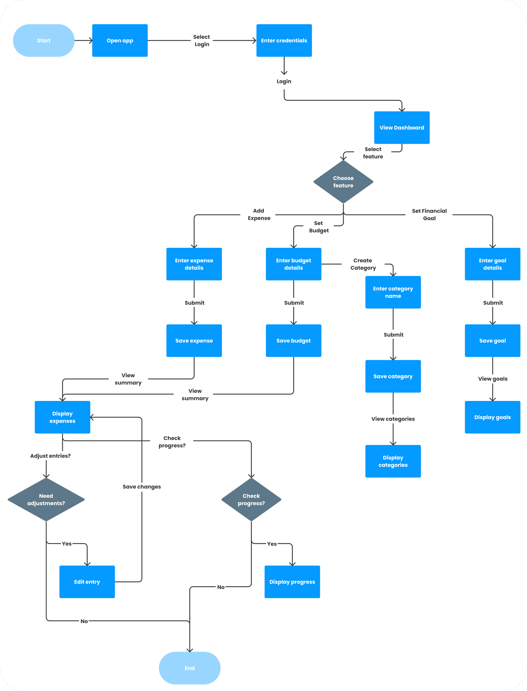
Flow Chart
To ensure Tracket felt intuitive from the first tap, I mapped out a streamlined user flow with minimal friction and maximum clarity. From the moment users open the app, the path is designed to feel simple and purposeful.
The flow follows a straightforward loop:
Onboard → Choose preferences and set goals
Track → Log expenses or savings manually
View → Get visual feedback through dashboards and summaries
Adjust → Update budgets, savings goals, or notification settings
Each step is built around real user priorities: control, clarity, and customization. By reducing cognitive load and removing unnecessary steps, I created a flow that supports daily or weekly check-ins—without overwhelming users.
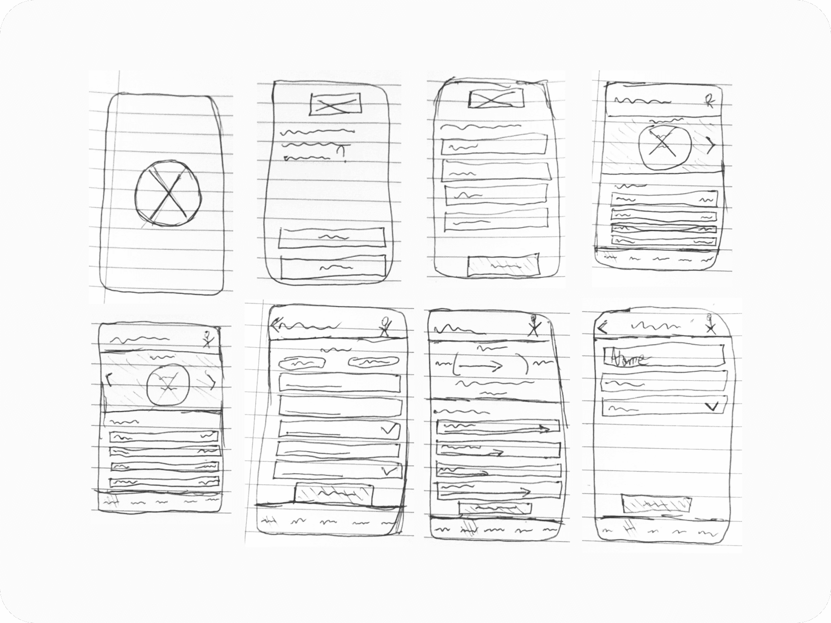
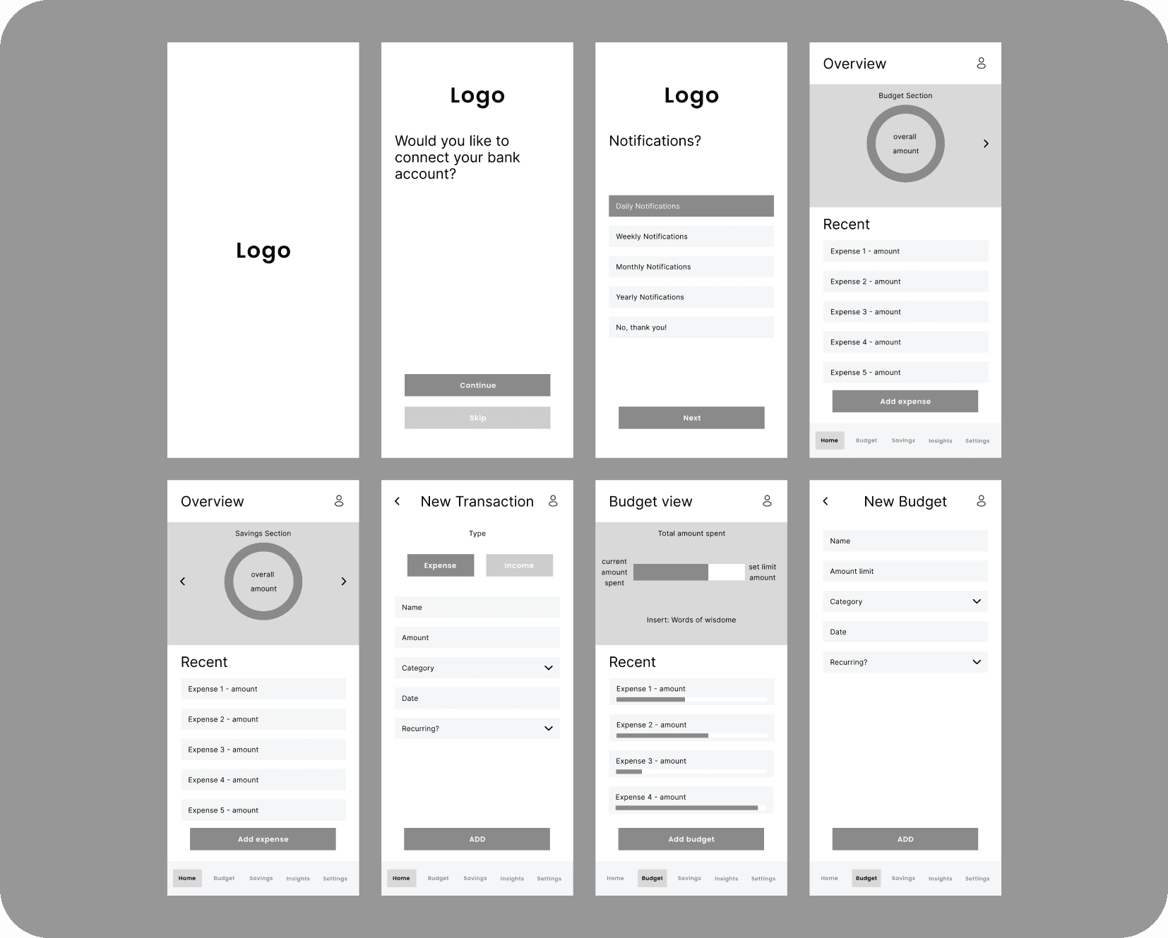
Low Fidelity Wireframes
I began with low-fidelity wireframes to map out the core user flows—onboarding, expense entry, goal tracking, and viewing insights. These quick sketches helped me focus on usability and hierarchy without getting distracted by visuals.
Mid Fidelity Wireframes
Next, I created mid-fidelity wireframes in Figma to refine structure and layout. I introduced modular components, simple navigation, and user-friendly prompts tailored to my three personas. Feedback at this stage led me to streamline interactions, merge screens, and adjust button placement for accessibility.
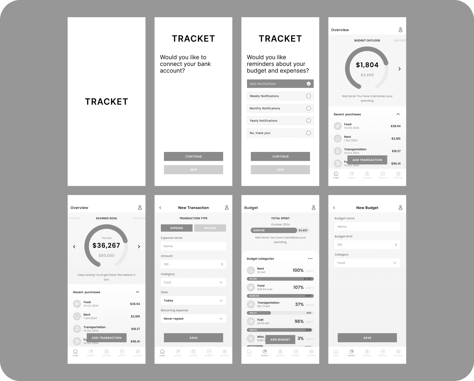
High Fidelity Wireframes
Once the structure felt solid, I moved into high-fidelity prototypes, applying the brand’s visual language: clean layouts, soft shadows, rounded corners, and friendly fonts. I introduced a customisable colour system for categories, dark mode support, and accessible contrast levels—all designed to make tracking finances feel calming, not clinical.

Wireframes to Prototypes
After testing low and mid-fidelity wireframes, I jumped into high-fidelity prototyping in Figma. Feedback from the first workshop helped shape:
A refined bottom navigation
Merged profile/settings screens (goodbye clutter!)
Adjusted category font sizes for visibility
Moved expense entry button to the bottom for one-handed access


Usability Testing
Method: Moderated (in-person + remote), Think-Aloud protocol
Tasks:
Sign up & complete onboarding
Add an expense
Set up a budget
View insights
Adjust settings
Success rate: 100% across all tasks
The Outcome
Tracket is an intuitive budgeting app that combines simplicity, customization, and privacy. It’s built for everyone—from the spreadsheet nerd to the budgeting beginner.
Features:
Manual and (optional) linked expense tracking
Category-based budgeting with smart visuals
Custom reminders and notification controls
Savings goal tracking
Fully responsive and mobile-optimized
Reflection
Designing Tracket was personal—it solved a problem I had, but more importantly, one shared by many. This project pushed me to:
Think beyond my own use case
Design for accessibility across age and tech skill
Iterate constantly based on user feedback
Make financial tracking feel less like homework and more like progress
Next steps?
Add a bill-splitting feature
Animate key UI elements (loading, progress, transitions)
Conduct longitudinal studies to refine usage over time
Explore gamification for savings incentives