Tutorful
I was asked to redesign onboarding for an online learning platform, with a focus on reducing drop-off and increasing activation.
UX/UI Designer
Figma
The Challenge
Improving onboarding to increase learner activation
For this design challenge, I was asked to redesign onboarding for a fictional online learning platform, with a focus on reducing drop-off and increasing activation. Activation was defined as completing onboarding, selecting a learning pathway, and starting a first lesson.
Rather than treating it as a simple flow redesign, I reframed onboarding as a confidence problem. Early hypotheses suggested learners may feel overwhelmed by choice, unclear about value, or unsure what to do next. I approached the challenge by focusing on clarity, reassurance, and momentum.
Approach
I structured the experience around three core questions:
What is this platform helping me achieve?
Is this learning path right for me?
What should I do next?
I developed two onboarding concepts. The first prioritised guided personalisation, progressively capturing learner goals and generating a clear recommendation. The second focused on speed, reducing upfront friction and getting learners into a first lesson quickly.
Both were designed mobile-first, with responsive considerations for desktop.
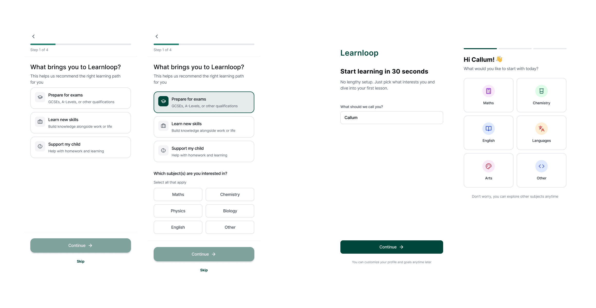
Onboarding Design Process
To explore different behavioural motivations, I developed two distinct onboarding concepts.
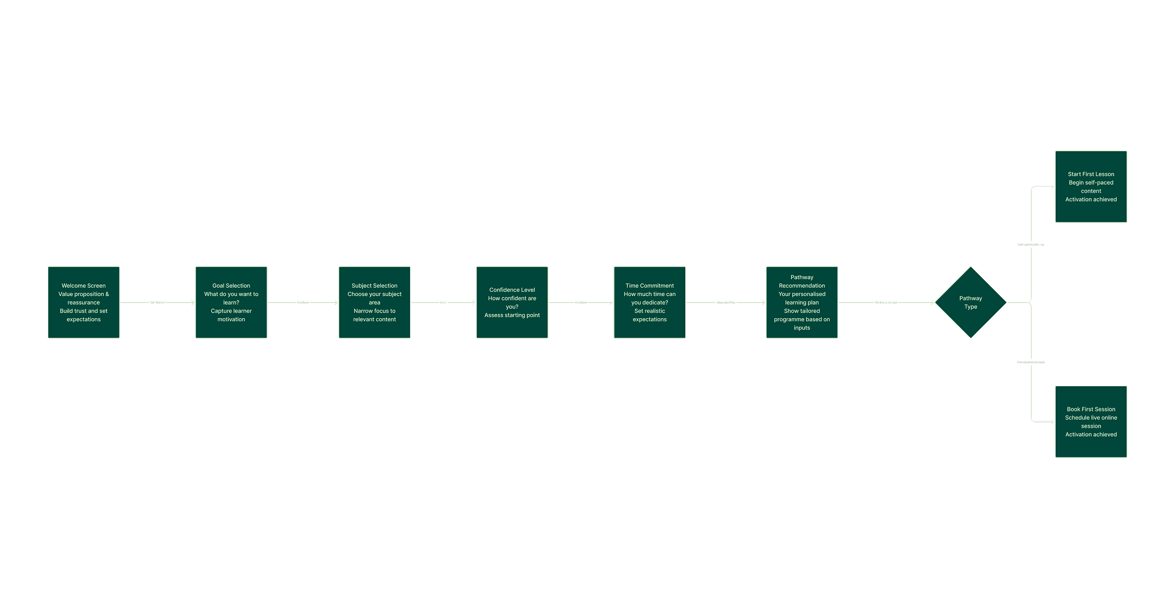
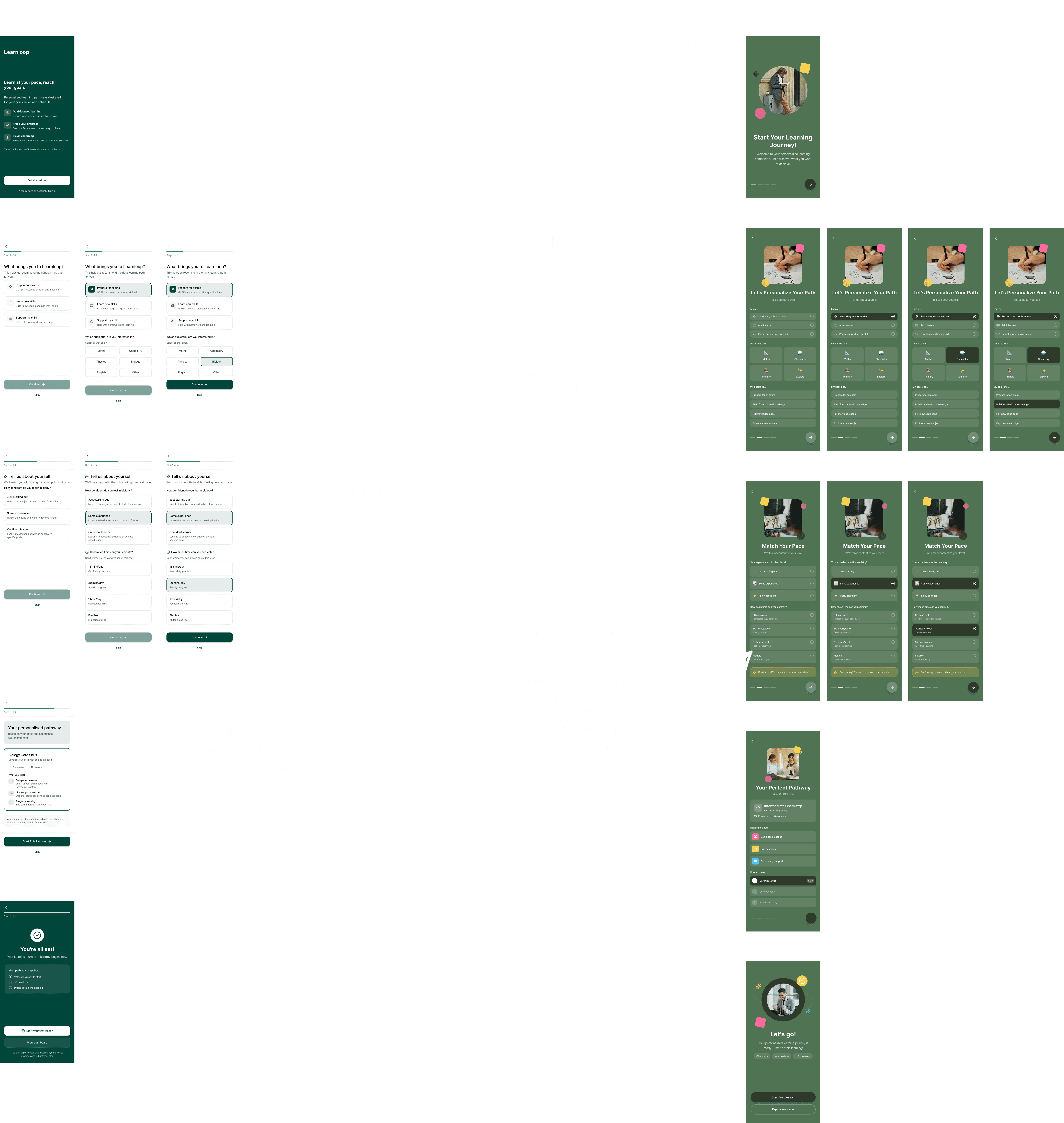
Concept A focused on guided personalisation. It progressively captured learner goals, confidence level, and time constraints to generate a clear, tailored recommendation. The emphasis was on reassurance and reducing overwhelm through structured guidance.
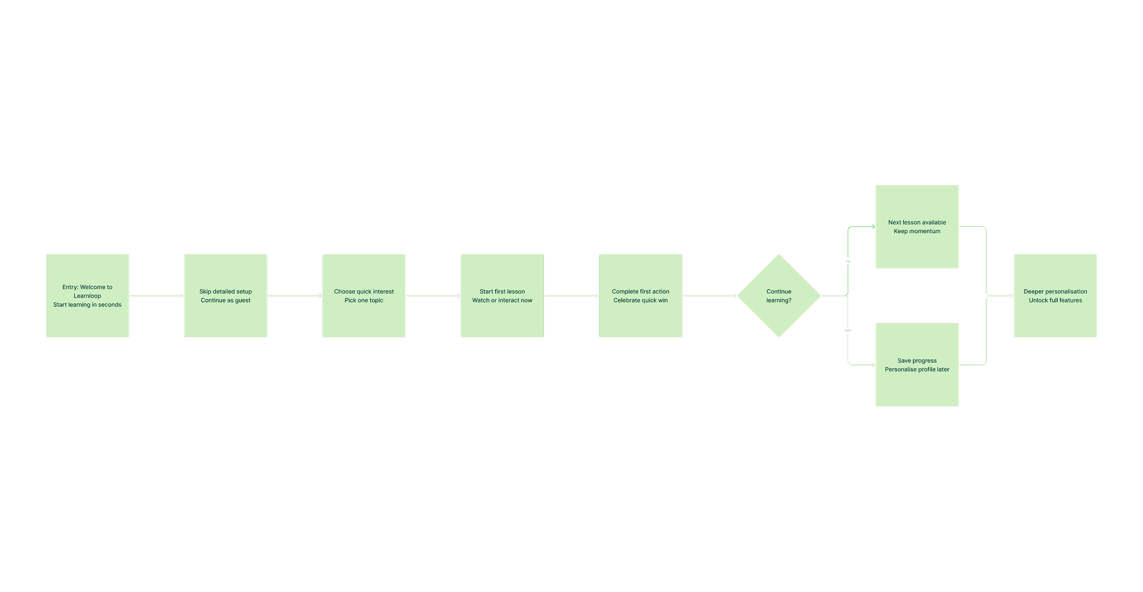
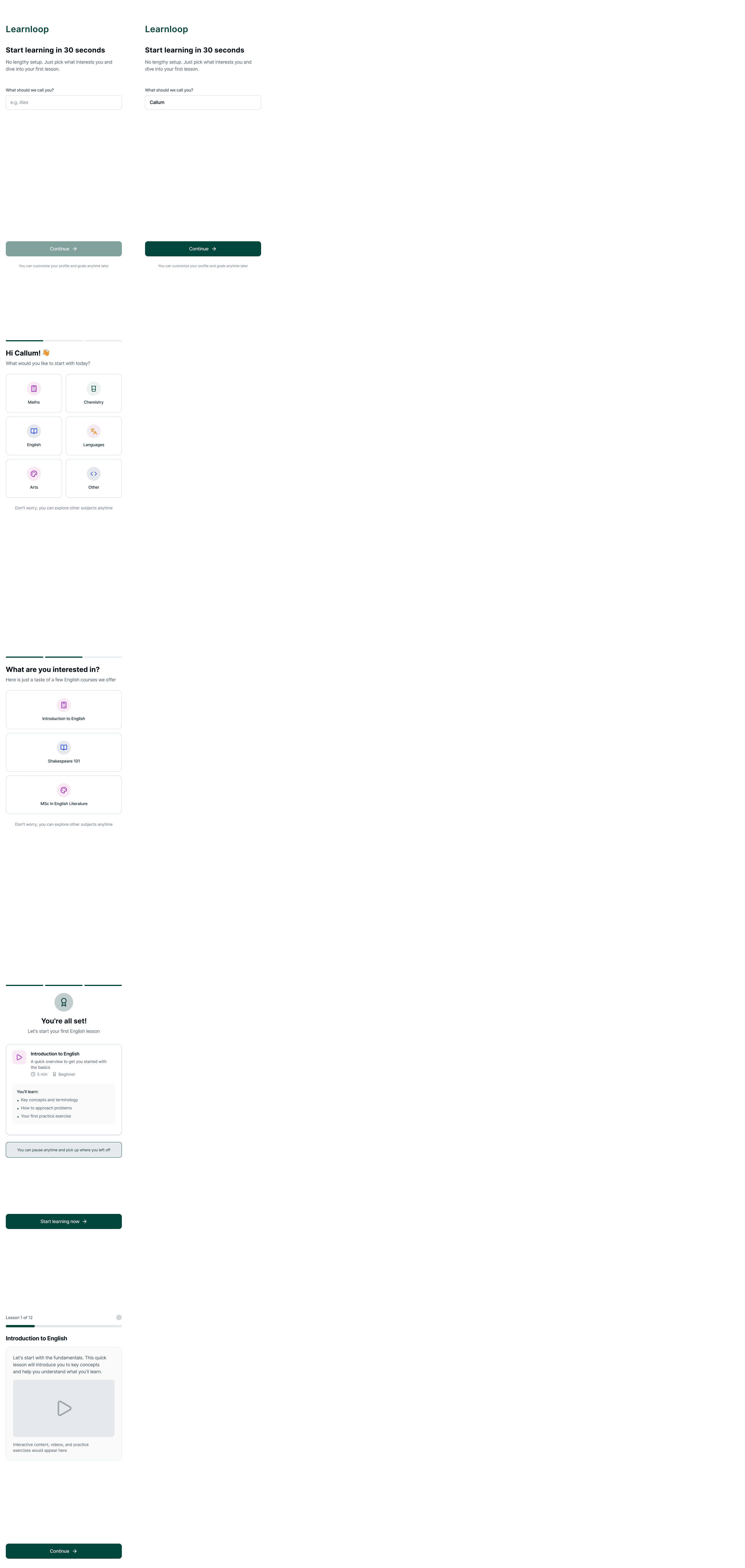
Concept B prioritised speed and early momentum. It minimised upfront friction and encouraged learners to begin a lesson quickly, deferring deeper personalisation until after engagement. This approach was designed for time-poor or action-oriented users.
Designing both directions clarified the trade-offs between depth and immediacy, and helped validate that activation is influenced as much by confidence as by simplicity.
Onboarding Concept A
Onboarding Concept B
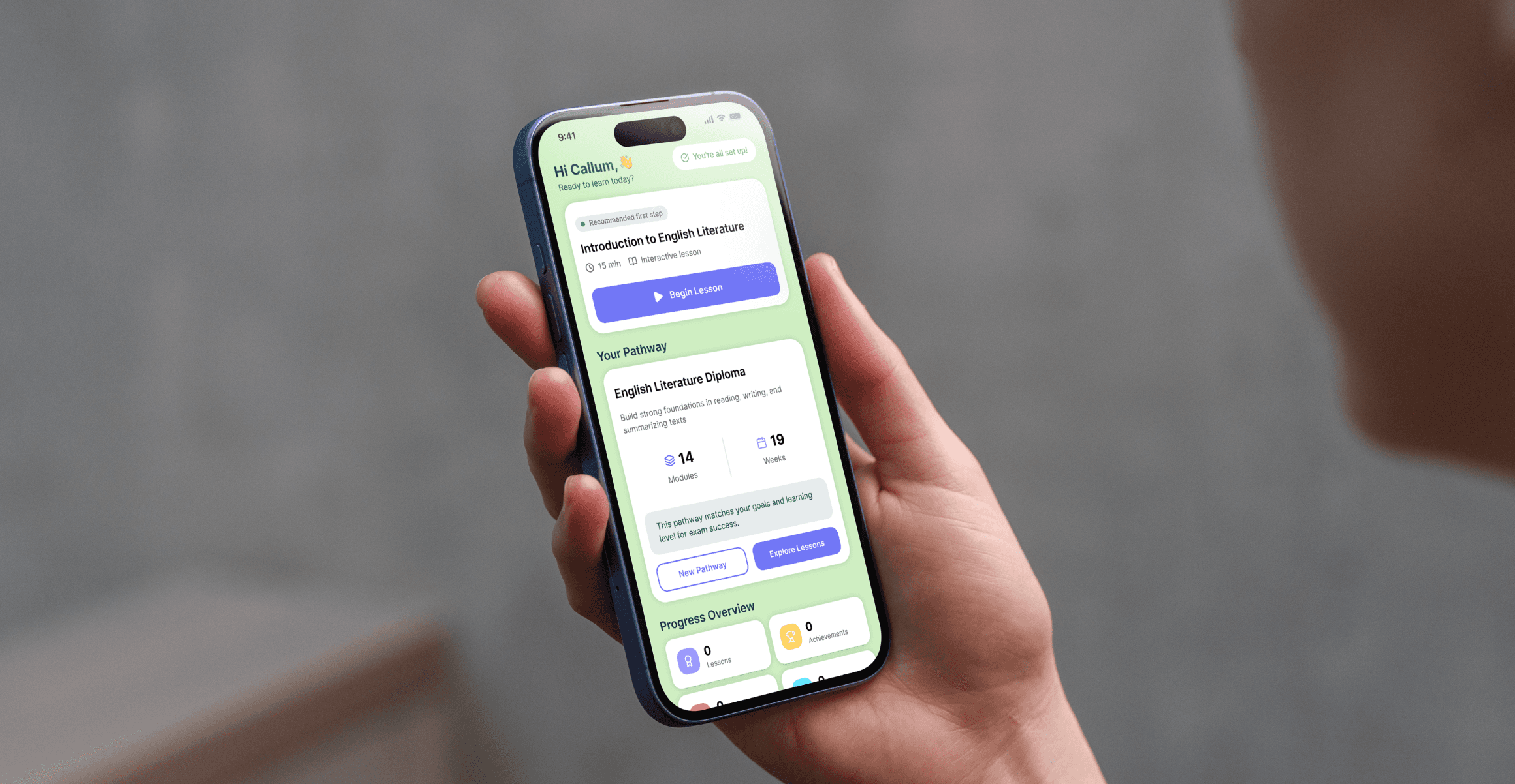
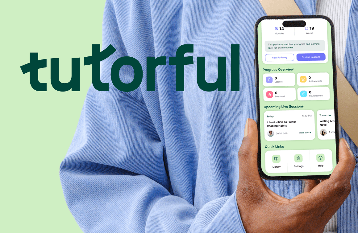
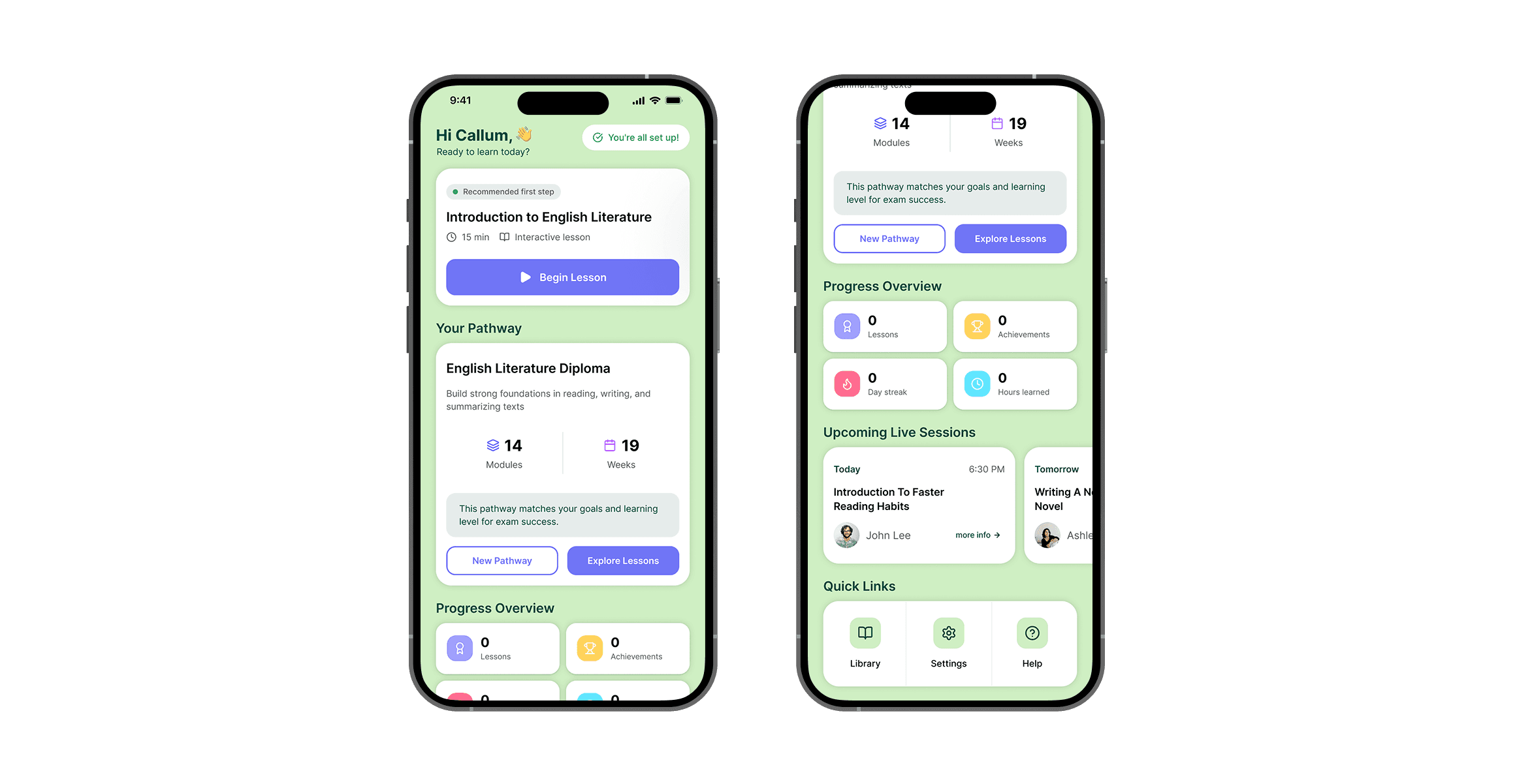
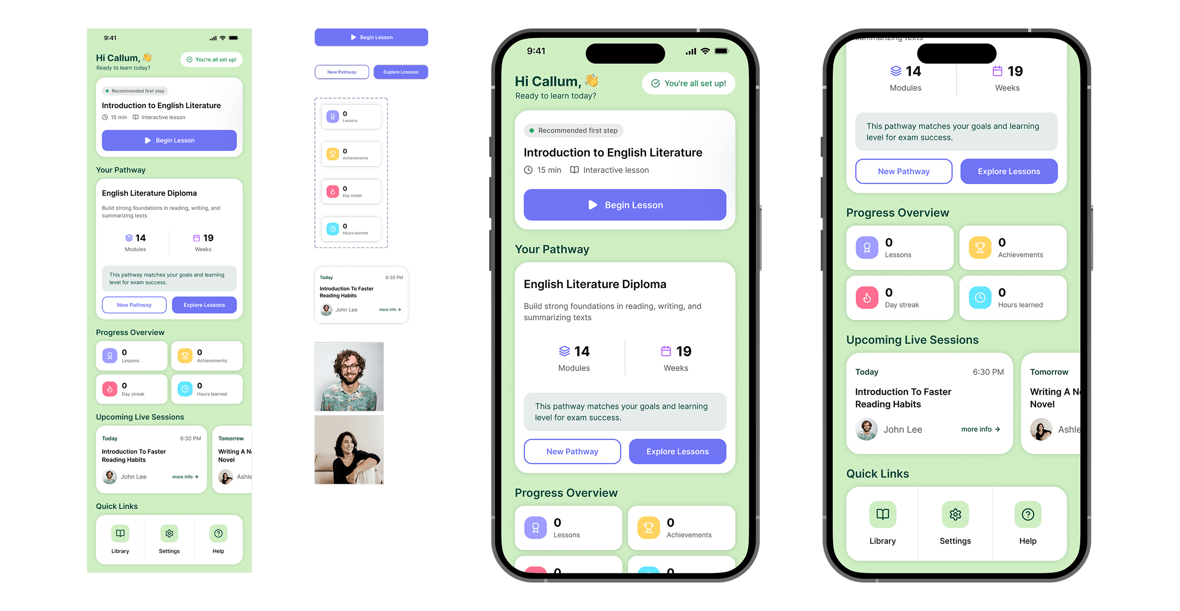
High-Fidelity Dashboard
For the high-fidelity prototype, I designed the first-time learner dashboard shown immediately after onboarding. The goal was to reinforce confidence and provide a clear next step rather than present multiple competing options.
I used the Untitled UI design system, leveraging existing components, tokens, and auto layout to maintain consistency. Where needed, I introduced small custom components that aligned with the system rather than redesigning patterns from scratch. A desktop adaptation was also created to demonstrate responsive thinking.
Outcome & Reflection
This was a genuinely engaging problem. I enjoyed exploring how hierarchy, messaging, and small design decisions can influence learner confidence and activation.
The challenge progressed to a second-round interview, with positive feedback on the clarity of thinking and structured approach. With more time, I would validate both onboarding concepts through usability testing and behavioural data to understand which approach most effectively drives activation.
The project reinforced that effective onboarding is less about collecting information and more about helping users feel certain enough to take their first meaningful step.